“The whole is greater than the sum of its parts.”
—This proverb has been incorrectly attributed to Aristotle in his seminal philosophy text Metaphysics, written sometime in the 1st Century B.C.E.
Aristotle’s actual quote is:
“In the case of all things which have several parts and in which the totality is not, as it were, a mere heap, but the whole is something beside the parts, there is a cause; for even in bodies contact is the cause of unity in some cases, and in others viscosity or some other such quality.”

I find it fascinating that the first quotation is misattributed and twists Aristotle’s original meaning. The difference in meaning between “greater” and “beside” is vast.
Proverb A. “The whole is greater than the sum of its parts.”
Proverb B. “The whole is something besides the parts.”
I have mindlessly heard proverb A used to explain gestalt’s meaning in every Art, Design, and Technology class and discussion I have studied.
As a designer, I prefer proverb B. Gestalt is the study of how human beings perceive the whole and draw conclusions among the parts that comprise the totality. The meaning of the whole shifts in relationship to the positioning of the individual elements. There is more give and take in this definition; I strive for balance in design work.
The quote above is an excellent example of how human beings see objects. When we look at something as a whole, more than just its parts, and even when they’re entirely separate entities, our brains try to group them into one larger image or concept called “gestalt.”
Several key ideas behind this psychodynamic theory have been studied extensively, with many studies conducted today.
4 Key ideas Surround Gestalt Theory
Emergence is the idea that we identify the whole before the parts. Designing with emergence in mind means that you should focus on creating an outline pattern rather than detailed drawings or text. Emergence allows people to recognize the whole even before identifying specific parts because their minds can start filling out what they know about it from other sources they have seen, read, or watched.
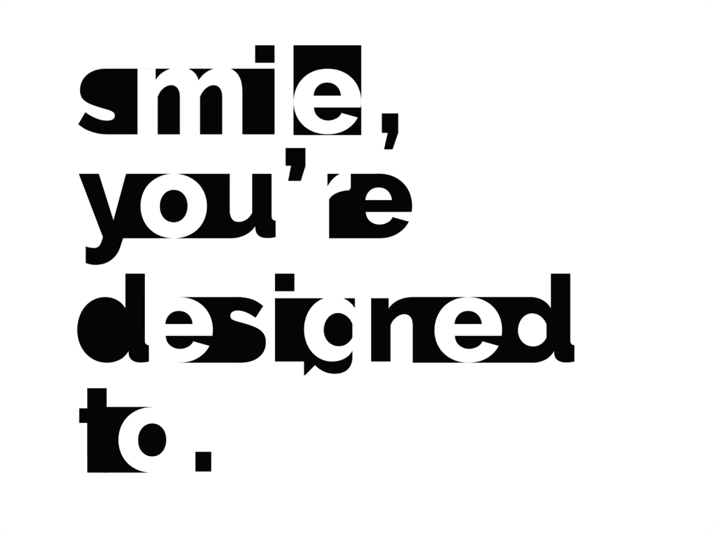
Reification is the process in which our mind fills in the gaps.
When we attempt to match what our eyes see with the familiar patterns stored in memory, there isn’t always an exact match. Instead of filling in all gaps and having a perfectly drawn picture or shape for each object outline, we find near matches that allow us enough information and then fill the gaps of what we think we should see. Reification suggests we can leave out parts of the outline as long as we provide enough of it to allow for a close enough pattern match.
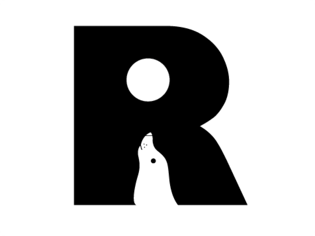
Left: Example of Emergence. A user will spot the R form before the seal illustration in the counter form.
Right: Example of Reification. The form and counter form relationship obfuscates a few of the letters, still, there is enough information to fill in the gaps.
Multi-Stability is the tendency of the mind to avoid uncertainty. Ambiguous perceptions move back and forth between interpretations. Some objects can have more than one interpretation, such as in this famous unattributed illustration in the October 1892 issue of Fliegende Blätter (Flying Sheets) a German Weekly Satire Magazine. The caption read, ” Which animals are most like each other? I won’t give the answer away, unless you speak German.
Invariance is the mind’s ability to spot similarities and differences without forgetting what has already been known. We rely on our ability to recognize objects regardless of their rotation or scale. Most people can quickly identify an object from any point in its 3D space. We’ve developed this skill over time by relying heavily upon context when viewing them. Recollected images come into play here, too, because they store information about how those shapes should look from different perspectives.


Left: A famous illustration from an 1892 German publication. The illustration can easily swap between a rabbit and a duck.
Right: Example of Invariance, A collection of images of a 3-D model from different vantage points. It can be used to build context of what is available in the cloud of data.
13 Gestalt Principles
“Simplicity is about subtracting the obvious and adding the meaningful.”
— John Maeda.
The Law of Pragnanz (A.K.A. Good Figure, or the Law of Simplicity) states that we perceive objects in their most straightforward, symmetrical, and orderly form. Therefore, when confronted with complex shapes, our brain tends to reorganize them into simpler components or a simplified whole.
Closure refers to our tendency to see objects as complete even when they are only partially visible. Think of the concept as the glue that holds disparate elements together. With the closure principle, our eye fills in missing information to create a complete figure, essentially combining parts into something more compact and less complicated overall.
Symmetry and order refer to our preference for balance and our desire for things to be in order. In a design context, designers can use this principle to communicate information quickly if our eyes seek stasis.
Similar concepts in art education are the principles of Unity, Variety, and Balance. Too much unity can create information underload; another word for this is boredom. Variety is the spice of life; however, too much of it will cause information overload; Confusion. Artists and Designers want to balance these forces to create tension and excitement, visual stimuli that captivate users to engage.

The Olympic flag is a great example of Good Figure, The rings are all placed together, interlaced, perceiving themselves as their own group.

The World Wildlife Fund panda icon displays an example of Closure, the dark elements are organized in a way to allow the negative space to fill in the gaps.
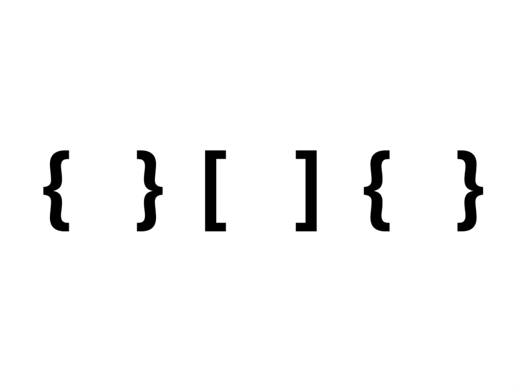
The Brackets show Symmetry, the curly brackets on the left and right frame the square brackets in the center.
Figure/Ground describes the way we distinguish between objects and their backgrounds.
But, of course, the eye will always try to understand what’s being seen by looking at compositions. One way this happens is with figure/ground, where the figures are separated from their background for you as an observer to identify positive elements or negative space respectively within those shapes.
A similar concept in Typographic design is Form and Counter, where the metal press type needed both the letter and the negative space to make an ink impression on paper. Technology advancements have made the need for physical typefaces obsolete, but the practice of using the counter form now has become a compelling design decision.
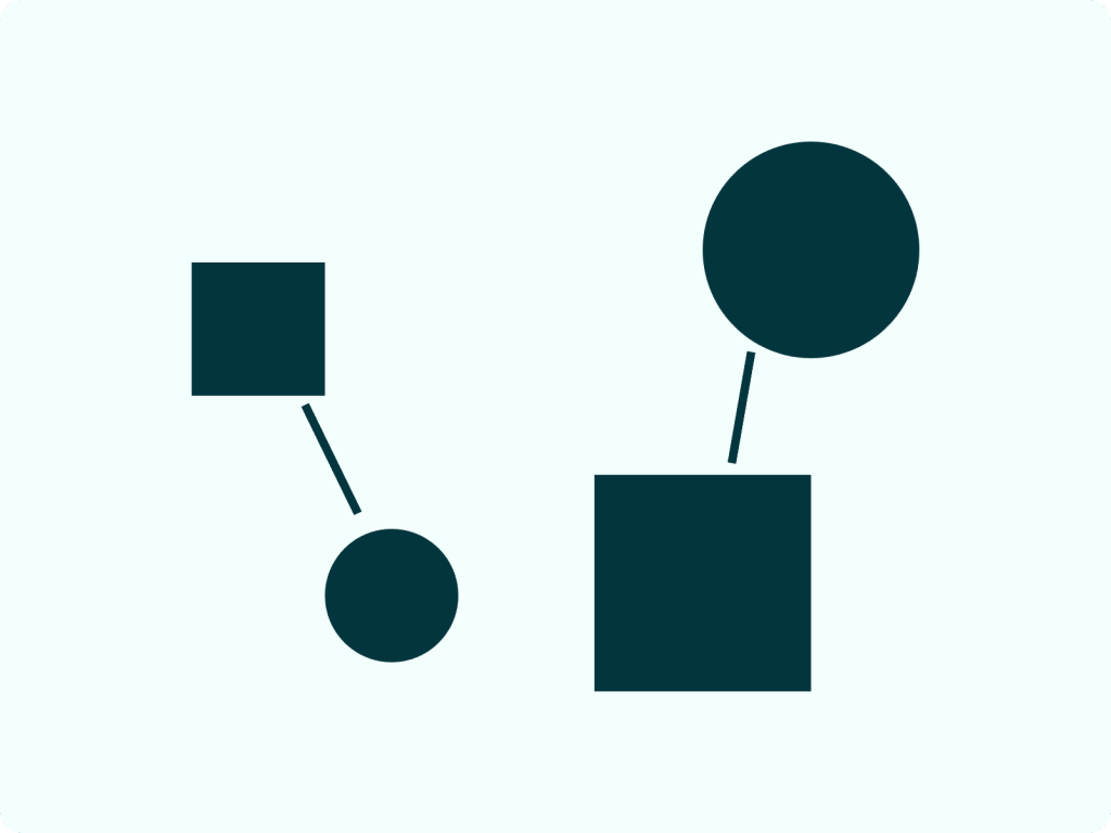
Uniform Connectedness means that we perceive objects as connected even when they are not physically connected. Elements can have visually solid cohesion without a physical connection.
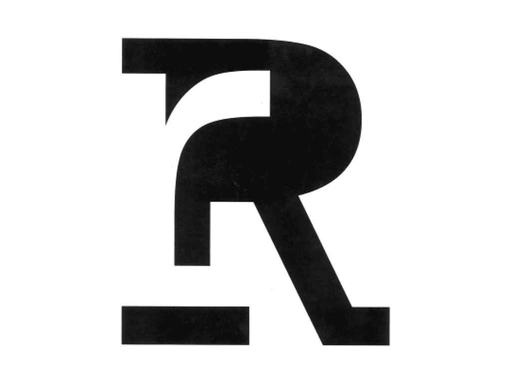
Left: the upper and lower case R design uses the figure of the uppercase R to frame the ground of the lower case r.
Right: an example of Uniform Connectedness. The corresponding circle and square pairings are linked together with a pair of broken lines.
Common Regions describe the tendency for us to see neighboring objects as belonging together. In the example, you can see information chunked in separate regions with box enclosures.
Proximity dictates that we group objects together based on their proximity. It is correct to assume proximity is similar to Common Regions, except the idea uses space and hierarchy choices to frame the enclosure rather than a bounding box. Proximity is Common Region’s more sophisticated cousin.


Left: An example of Common Region. The groupings of circles are framed by a dashed bounding box.
Right: An example of Proximity; is a very similar concept but uses space to frame each grouping.
Continuation suggests that we perceive objects as continuing in a specific direction, even when they are not doing so. Dotted lines converging and pointing to other related elements is a great way to see the continuation principle in action.
Common Fate states that we group objects together based on their movement or trajectory. The element of Common Fate can be present even if the pieces are not moving. It’s more that they’re seen as having a common destination; these examples of arrows show which parts are related. You can see how Design teams can use this principle in clearly organized storyboards to aid in the production of animation work.
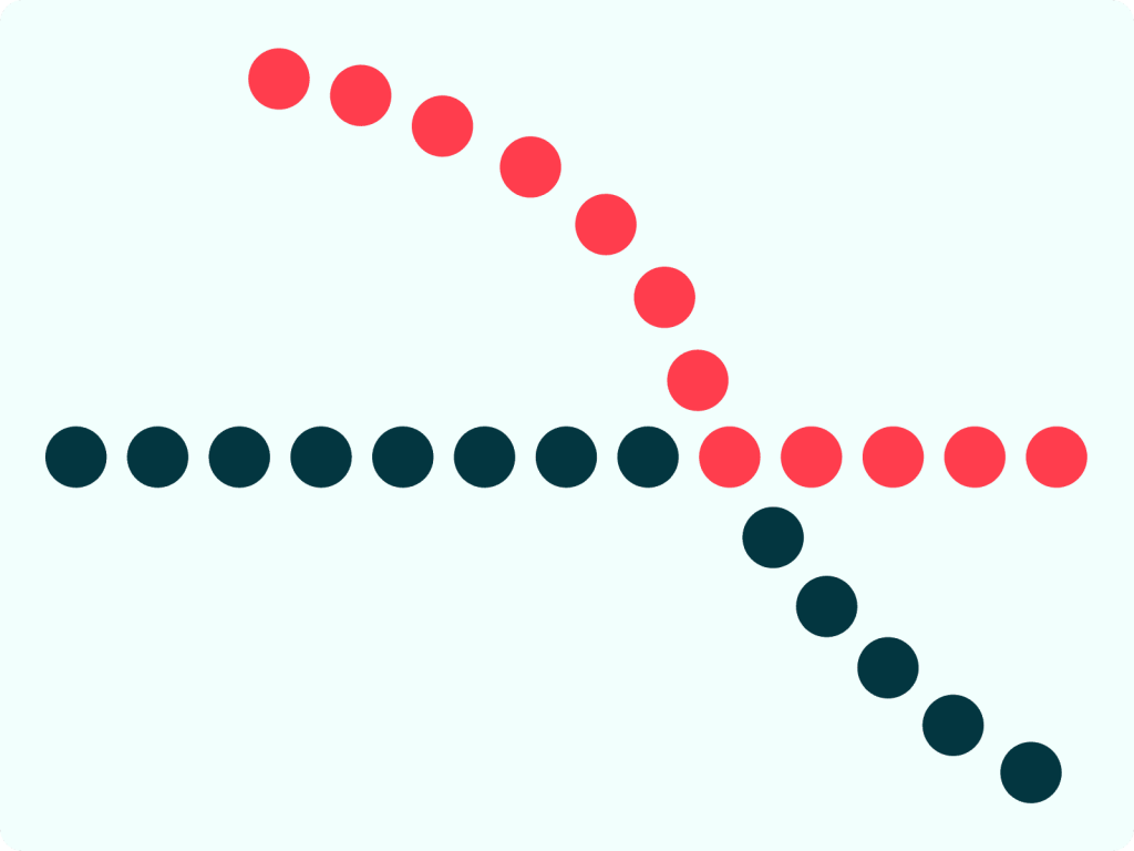
An example of Continuation, the color choices make clear the direction converging circles.

Common fate uses direction cues with lines and arrows. In a static design, utilizing this principle can be useful in providing context in implied movement.
Parallelism dictates that we group objects together based on their similarities in shape or size. Lines are often interpreted as pointing or moving in some direction. Parallel lines are seen as either pointing or moving in the same direction and are thus related.
Similarity states that we group objects together based on their similarities in appearance. The human brain is powerful. It can instantly determine how related two objects or concepts are based on their similarities in shape, size, color, and texture without comparing every detail of each item.


Left: An example of Parallelism, groups of lines can be made by a shared angle.
Right: Similarity groups like forms together, like in this illustration that can easily pair red circles from black circles.
Focal points suggest that contrasting elements will draw our attention. There is likely an evolutionary explanation for this: we need to identify unknowns quickly so they don’t get us into trouble. Focal Points and Similarity are closely related; you need sameness to help define contrast.
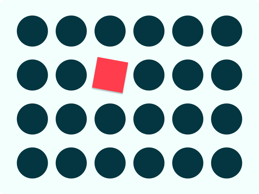
An example of Focal Point in usage: the singular rotated red square with drop shadow is an obvious visual starting point in a field of the like circles.
Past Experiences tend to be perceived according to a users mental models. Past Experiences is a complex principle to explain as it encompasses elements of the above principles. Past Experiences tie deeply to users’ existing mental models about the design of anything from software applications to the layout of a grocery store.
Mental models are abstract, inner representations that people have regarding things from the external world. Mental models include your basic ideas of what something is or how it is supposed to work. Designers frequently research to identify users’ mental models and apply these findings to a design framework to build on top of the users’ existing expectations and beliefs.
You see many similar interaction patterns in design systems throughout your day-to-day life. For example, if a point of sale terminal challenged the mental model of how a user paid for an item, it would make the user’s task more difficult and stressful. Past experiences can range from how different cultures perceive color or words to how users buy cereal at the grocery store. This principle requires considerable empathy and research.
These principles and ideas play an important role in how we perceive the world around us. Therefore, understanding and applying Gestalt principles can result in more aesthetically pleasing and humanity-centered designs for designers.

A iPhone screen depicting an incoming phone call is a design that has considered a user’s past experiences. It is relying on headset icons to display pickup and hang-up options. Despite the fact headsets are less frequent, the icon is represented in metal models of older users.